
Conversion Rate Optimization: A Data Method for SMBs
Optimizing your conversion rate starts with finding where your site is losing customers, then fixing the leaks that pay off the most first. The method comes down to four steps: locating drop-offs in Google Analytics 4, checking speed with Lighthouse, removing UX friction page by page, then ranking fixes by return on investment. Gaining 1 conversion point on 20,000 sessions with a €100 average order value works out to roughly 200 extra sales, without a single extra euro of traffic. Under 100 conversions per variant per month, qualitative analysis beats A/B testing.

Key takeaways
- The median e-commerce conversion rate sits between 2% and 5% depending on the industry: comparing yourself to your own sector beats comparing to a global average.
- Gaining 1 conversion point on 20,000 sessions with a €100 average order value works out to roughly 200 extra sales, without spending an extra euro on traffic.
- A load time that goes from 1 to 3 seconds can cut mobile conversions by 20 to 30%: speed is a conversion lever, not a technical detail.
- Prioritizing fixes with an impact/effort matrix keeps your budget from getting spread too thin: 2 or 3 targeted fixes beat 15 gut-feel tweaks.
- A reliable A/B test needs a minimum volume of conversions per variant; under 100 conversions a month, qualitative analysis (heatmaps, GA4) beats statistical testing.
Table of contents
- Why CRO pays off more than buying traffic
- Finding the leaks in your funnel with GA4
- Load speed: an underrated conversion lever
- The UX friction points that drive visitors away
- Prioritizing your fixes by ROI, not by gut feeling
- Testing your hypotheses: A/B test or qualitative analysis?
- Building your conversion dashboard
- Scaling your CRO process without an agency
- Frequently asked questions
Why CRO pays off more than buying traffic
Optimizing your conversion rate makes more money than buying traffic, because it puts existing visitors to better use at no extra acquisition cost. Every conversion point you gain applies to 100% of your current traffic, not just new arrivals.
The logic is purely arithmetic. Doubling your traffic is expensive: more Google Ads budget, more SEO content, more time. Gaining 1 conversion point only costs the time it takes to fix what's holding people back. And the effect shows up in revenue immediately.
I've spent five years analyzing GA4 accounts for small e-commerce businesses, and the pattern keeps repeating: sites spending €3,000 a month on acquisition with a 1.2% conversion rate, while their industry sits at 2.5%. Bringing that site up to its sector's median nearly doubles sales, at the same ad budget.
What's a good conversion rate for your industry?
A good e-commerce conversion rate falls between 2% and 5% depending on the industry, but the only comparison that actually helps is with your own sector. Measuring yourself against a global average doesn't tell you much: fashion, grocery, and industrial B2B aren't playing the same game.
Apparel often converts around 2%, appliances climb to 3-4%, and some subscription niches top 6%. Baymard Institute data also shows an average cart abandonment rate of around 70% across global e-commerce. In other words, 7 out of every 10 filled carts never turn into an order.
| Industry | Median observed conversion rate |
|---|---|
| Apparel / fashion | 1.5% to 2.5% |
| Beauty / cosmetics | 2.5% to 4% |
| Appliances / electronics | 1% to 2.5% |
| Food / grocery | 3% to 5% |
| Subscription / B2C SaaS | 4% to 7% |
Before you touch anything, put your own number next to these benchmarks. If you're below the low end of your sector's range, the upside is significant.
How much is 1 conversion point worth?
Gaining 1 conversion point on a site that gets 20,000 sessions a month, with a €100 average order value, generates roughly 200 extra sales a month, or €20,000 in additional revenue, without spending an extra euro on traffic. The math is straightforward: 1% of 20,000 sessions is 200 more conversions.
Here's a real example. On an e-commerce site I worked with in early 2024, the acquisition budget was fixed at €2,500 a month, traffic was stable, and the average order value was €85. Going from 1.4% to 2.1% conversion took the site from roughly 280 to 420 orders a month. Result: 140 more sales, close to €12,000 in additional revenue, without touching the ad budget.
That's the whole point of CRO (conversion rate optimization): the lever works on all of your traffic, not just one segment. To dig into the measurement logic behind these decisions, our web analytics method for deciding fast walks through the seven steps that turn a number into action.
Finding the leaks in your funnel with GA4
The first thing to do when optimizing conversions is to find the exact step where visitors drop off. Google Analytics 4 spells it out in its funnel report. Until you know where the leak is, you're fixing things blind.
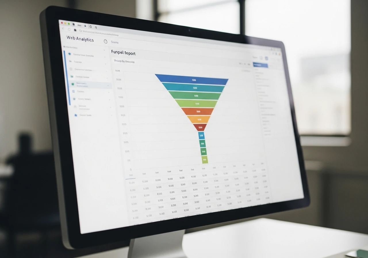
Think of your conversion funnel like a leaky pipe. There's no need to replace the whole thing, just find where the water's escaping. GA4 does exactly that for your purchase journey. Product page, cart, shipping, payment: at each step, the tool counts how many people move on and how many drop off.
When I open a GA4 account for the first time, the first thing I do is build a funnel exploration. You lay out your key steps in order, and GA4 shows the pass-through percentage between each one. Whichever step shows the sharpest drop is your priority number one.
How do you read the step-by-step drop-off rate?
The step-by-step drop-off rate shows up right in GA4's funnel exploration: each step shows the percentage of visitors who move on to the next one, and the sharpest drop reveals the bottleneck. Some loss at each step is normal, but a drop of more than 50% at once signals a real problem.
Focus on the critical transitions. From cart to shipping page, a drop-off above 60% usually means shipping costs are shown too late. From payment page to confirmation, a sharp drop points to a form that's too long or a payment bug. The official Google Analytics documentation explains how to set up these steps in detail.
On most of the small businesses I audit, the "cart to shipping" step alone accounts for 40 to 60% of all drop-offs. That's almost always the place to look first.
Which GA4 reports reveal a page that's losing you customers?
Three GA4 reports expose a page that's driving customers away: the page engagement report, the paths report, and the conversion rate by landing page. Cross-reference them and the problem page shows up fast.
In the engagement report, look for pages with high traffic but low engagement time: a sign the content is disappointing visitors. The paths report shows where people exit. Conversion by landing page reveals which entry pages actually drive sales, and which ones just attract browsers. For more on reading the reports that matter, our guide to analyzing Google Analytics and spotting the reports that count lists the six GA4 tables that really matter.
Load speed: an underrated conversion lever
Load speed is a direct conversion lever, not a technical detail: a site that goes from 1 to 3 seconds of load time can lose 20 to 30% of its mobile conversions. Most CRO guides skip over this, even though it's often the first leak worth fixing.
Google established this link a long time ago. According to research published on web.dev by Google's teams, bounce probability climbs sharply as load time increases. A slow mobile site means a customer closing the tab before they even see your offer.
What I see business owners miss most often: they test their site on their fiber connection at the office, decide it's fast, and move on. But 60 to 70% of e-commerce traffic now comes from mobile, often over 4G while commuting. Your customer is testing your site under conditions far worse than yours.
Three metrics tell the story of your site's perceived performance, grouped under the name Core Web Vitals (Google's essential web signals). Click responsiveness (INP, the delay between an action and the page's visible reaction), main content load speed (LCP), and visual stability (CLS, whether the page jumps around while loading). Search Console pulls all three into a single report.
How does Lighthouse identify conversion blockers?
Lighthouse, the free measurement tool built into Google Chrome, gives a performance score out of 100 and lists exactly what's slowing you down, ranked by potential time saved. You can run the audit in a few clicks from the browser's developer tools, or through PageSpeed Insights.
The report doesn't stop at a score. It breaks down oversized images, JavaScript code that blocks rendering, badly loaded fonts, and quantifies the time saved for each fix. A mobile score under 50 is a red flag: your site is slow where it matters most.
Aim for a mobile score above 70 and an LCP under 2.5 seconds. On an e-commerce site with about ten employees that I followed last year, cutting mobile LCP from 4.1 to 2.3 seconds pushed mobile conversion up by nearly a point. One technical fix, a direct effect on sales. Our full seven-step website audit method covers this speed pillar in detail.
The UX friction points that drive visitors away
UX friction points are the small obstacles that discourage a purchase: a form that's too long, a button that's hard to see, a forced account creation. Removing them often wins more conversions than a full redesign. Every extra click costs you a customer.

The classic mistake is wanting to rebuild everything. That's rarely necessary. Friction gets tracked down page by page, action by action.
On the product page:
- Photos too small or no zoom option: the customer can't properly judge the product.
- Hidden shipping cost: show it on the product page, not at checkout.
- Call-to-action (the main action button) buried in the page or low-contrast.
These three points account for most of the losses on product pages. On top of that, the absence of social proof (customer reviews, ratings, sales numbers) plays a reassuring role that's often underestimated: a hesitant visitor is looking for confirmation that others have bought before them.
On the cart and checkout:
- Surprise shipping fees at the last step: the top cause of abandonment according to Baymard.
- A checkout form that's too long: every unnecessary field cuts completion.
- Forcing an account creation before payment.
On that last point, the analogy is simple: it's like a cashier asking you to fill out a membership form before you check out. Nobody would accept that in a physical store. Limited payment options play a role too: the absence of installment payments or wallets (Apple Pay, PayPal) turns away a meaningful share of mobile buyers.
What strategy can improve your conversion rate?
The most effective strategy is to remove friction points one by one, starting with the cart and checkout, where purchase intent is strongest. A visitor who's reached checkout wants to buy: don't let a minor detail send them away.
Show fees upfront, shorten forms, enable guest checkout. These simple, individually measured moves almost always beat an expensive redesign. To see the actual friction points, tools like Hotjar or Matomo (a privacy-friendly French alternative) record sessions and generate heatmaps, showing where people click and where they get stuck.
Should you offer guest checkout?
Yes. Guest checkout removes the requirement to create an account before buying, which is one of the top causes of cart abandonment according to Baymard research. Forcing account creation is like asking for a commitment before the sale.
Let the customer pay in two clicks, then offer account creation after the purchase, at the confirmation step. You still get their email, but you don't lose the sale. Payment solutions like Stripe natively support this guest flow. On the accounts I work with, turning on guest checkout regularly adds 5 to 10% to cart conversions.
Lysible spots this kind of friction directly in your GA4 funnel and ranks it by estimated impact, so you can prioritize without guessing.
Prioritizing your fixes by ROI, not by gut feeling
Prioritizing your CRO work by return on investment rather than gut feeling keeps you from wasting your budget. Two or three targeted fixes beat fifteen random tweaks. The trap small businesses fall into is trying to improve everything at once and finishing nothing.

The method I use fits into a four-box matrix: sales impact on the vertical axis, implementation effort on the horizontal axis. You place each optimization idea in a quadrant, and the decision becomes obvious.
| Quadrant | Impact | Effort | Decision |
|---|---|---|---|
| Quick wins | High | Low | Do it right away |
| Big projects | High | High | Plan it, budget it |
| Nice-to-haves | Low | Low | Do it if you have spare time |
| Traps | Low | High | Ignore it |
Always start with the quick wins: high impact, low effort. Showing shipping costs earlier, enabling guest checkout, making a button bigger. These take a few hours and pay off fast. Bigger projects like a mobile redesign can wait their turn, budgeted separately.
The quadrant to avoid is the "traps" corner: low impact, high effort. Redesigning your logo's color, polishing a decorative animation. It keeps you busy, it doesn't convert. This same prioritization logic runs through our 10 digital marketing KPIs to track when you run a small business, where sorting the signal from the noise makes all the difference.
How do you rank your optimization projects?
Give each project an estimated sales impact score and an effort score, then tackle the high-impact, low-effort ones first. A simple spreadsheet is enough: two columns, a score from 1 to 5 on each axis.
Estimate impact from your GA4 data. A leak affecting 40% of your visitors at the cart stage matters far more than a detail on a page seen by 2% of your traffic. You already know the effort: a few hours, or a project spanning several weeks. Impact divided by effort gives you your order of battle. Three well-chosen projects beat a list of twenty ideas that never get finished.
Testing your hypotheses: A/B test or qualitative analysis?
For a small business, A/B testing is only reliable above a certain volume: under 100 conversions per variant per month, it doesn't tell you anything statistically valid, and qualitative analysis pays off better. Most guides forget to mention this.
Conventional wisdom pushes A/B testing everywhere, as a mandatory step in CRO. That's bad advice for a small business. An A/B test compares two versions of a page and measures which one converts better, fine. But for the difference to be reliable, you need enough conversions on each version. With 30 conversions a month, the test will take quarters to conclude, or reach the wrong conclusion.
| Monthly conversion volume | Recommended method |
|---|---|
| Under 100 | Qualitative analysis: heatmaps, session recordings, GA4 reports |
| 100 to 500 | A/B tests on high-impact changes only |
| Over 500 | Regular A/B tests, multivariate testing possible |
Below that threshold, look at how people actually use your site instead. Session recordings show hesitation, rage clicks, mid-form abandonment. It's qualitative, but it points to real problems that no number alone would reveal. And it's immediately actionable.
What's an example of conversion rate optimization?
A concrete example: on a product page, moving the "Add to cart" button above the fold and showing shipping costs right next to it. On a site I followed, this change pushed cart conversion up by several points within weeks. No A/B test needed, the problem was visible right there in the session recordings.
Another common example: shortening a quote request form from nine fields to four. The less you ask for, the more you get. This kind of fix, spotted by eye and by watching how visitors actually behave, often outperforms weeks of statistical testing for a small business.
How much traffic do you need for a reliable A/B test?
An A/B test becomes statistically reliable at around 100 conversions per variant per month, meaning enough traffic to generate that volume on the page being tested. Below that, the measured difference is down to chance, not a real effect. It's better to decide based on qualitative observations instead.
If your site converts 200 times a month in total and you're testing a mid-funnel page, each variant might see 40 or 50 conversions. Not enough. Wait until you have the volume, or test only on your highest-traffic pages. Understanding which channel drives those conversions also helps focus your tests: our article on marketing attribution and the channel driving your sales covers this in more depth.
Building your conversion dashboard
A good conversion dashboard runs on five metrics tracked weekly, not a report with twenty charts nobody reads. Simplicity beats thoroughness when you're running a small business with ten minutes a week to look at the numbers.
Too many business owners drown in data and get nothing out of it. That's the opposite of steering the ship. Pick a few metrics, check them every week, compare against the week before. It's the trend that matters, not the absolute value on any given day.
Which metrics should you track every week?
Five metrics are enough to steer your conversion: overall conversion rate, cart abandonment rate, mobile conversion rate, Lighthouse speed score, and average order value. These five numbers tell the whole story.
| Metric | Where to find it | Alert threshold |
|---|---|---|
| Overall conversion rate | GA4 | Below your sector's median |
| Cart abandonment rate | GA4 (funnel) | Above 75% |
| Mobile conversion | GA4 (mobile segment) | 40% lower than desktop |
| Mobile Lighthouse score | Lighthouse / PageSpeed | Under 70 |
| Average order value | GA4 / your back office | Declining over 4 weeks |
Mobile conversion rate deserves special attention. When it falls sharply behind desktop, it's almost always a speed or touch-usability problem. Checking these five numbers every Monday morning puts you ahead of any competitor steering by gut feeling. For the SEO and indexing side, our guide to managing SEO with Google Search Console is a useful complement to this dashboard.
Scaling your CRO process without an agency
Tracking conversion seriously means cross-referencing multiple sources: GA4 for behavior, Search Console for incoming traffic, Lighthouse for speed. Juggling these tools eats up a huge amount of time and loses non-technical business owners along the way. That's exactly the barrier Lysible removes, by centralizing this data and translating it into clear actions, without analyst jargon. You see at a glance where your site is losing customers, which fix pays off the most, and what to start with on Monday. Instead of paying an agency for every audit, you build the skill in-house at your own pace, with recommendations prioritized by return on investment. Managing conversion becomes a routine, not a project.
Frequently asked questions
How do you optimize conversion rate?
To optimize your conversion rate, follow four steps in order. First, locate the leaks in your funnel using Google Analytics 4's funnel report. Next, check mobile load speed with Lighthouse, since a slow site drives buyers away. Then remove UX friction page by page: shipping costs shown early, guest checkout, short forms. Finally, prioritize your fixes with an impact/effort matrix to tackle the highest-return actions first. This method keeps you from spreading your budget too thin and focuses effort where it actually pays off.
What's a good conversion rate?
A good e-commerce conversion rate sits between 2% and 5%, but it all depends on your industry. Fashion often runs around 2%, grocery climbs to 3-5%, and subscriptions sometimes top 6%. The only comparison that's actually useful is with your own sector, not a global average that means nothing. Put your number next to your sector's range. If you're below the low end, your upside is significant and deserves priority before any additional ad spend.
How do you calculate your conversion rate?
Conversion rate is calculated by dividing the number of conversions by the number of sessions, then multiplying by 100. For example, 300 orders out of 15,000 sessions gives a rate of 2%. Google Analytics 4 calculates it automatically, but you can also work it out by hand from your back office. Remember to segment it: mobile versus desktop conversion, conversion by traffic source, conversion by landing page. These sub-views reveal far more than the overall figure. A mobile rate well below desktop almost always points to a speed or touch-usability problem.
Does load speed affect conversion rate?
Yes, significantly. A site that goes from 1 to 3 seconds of load time can lose 20 to 30% of its mobile conversions. Research published by Google on web.dev shows bounce probability rises sharply with every extra second. Mobile is hit hardest, since visitors there often browse under degraded network conditions. Test your site with Lighthouse or PageSpeed Insights, aim for a mobile score above 70 and a main content display under 2.5 seconds. Speed is a real conversion lever, not a detail reserved for developers.
How long before you see CRO results?
The first results from a conversion optimization often show up within two to four weeks, the time it takes to gather enough data to measure the effect. Quick wins like showing shipping costs earlier or enabling guest checkout produce an almost immediate effect. Bigger projects, like a mobile redesign, need more patience. Plan on roughly a month-long cycle per optimization to confirm it's working before moving to the next one. The common mistake is changing everything at once: you'll no longer know which action produced which result.
What strategy could improve your conversion rate?
The most cost-effective strategy is to remove friction points one by one, starting with the cart and checkout, where purchase intent is highest. Show shipping costs from the product page, offer guest checkout, shorten your forms, add customer reviews as social proof. These simple, individually measured moves almost always beat an expensive redesign. Use Hotjar or Matomo heatmaps to see where visitors actually get stuck. Then prioritize with an impact/effort matrix to tackle what pays off the most, fast.
Should you always run A/B tests to optimize?
No. A/B testing is only reliable above roughly 100 conversions per variant per month. Below that threshold, the measured difference comes down to chance, and the test either reaches the wrong conclusion or takes months to conclude at all. For most small businesses, qualitative analysis pays off better: session recordings, heatmaps, and GA4 reports reveal concrete problems that are immediately actionable. Save A/B tests for your highest-traffic pages, once you've reached sufficient volume. Deciding based on real visitor behavior is often better than waiting for a statistical significance that will never arrive.
What's an example of conversion rate optimization?
A simple and effective example: moving the "Add to cart" button above the fold on the product page, and showing shipping costs right next to it. This change reduces customer uncertainty at the decisive moment. Another common example: shortening a quote request form from nine fields to four, since every field you remove raises the completion rate. Or enabling guest checkout to avoid forcing account creation before purchase. These targeted optimizations, spotted through session recordings, produce measurable gains within weeks, without heavy statistical testing.

Isaac SIKORSKI
With Lysible, I want to give businesses back control of their online presence. A website you actually understand is one that brings in real opportunities.